Hi everyone! Happy Thursday! Hope you had a great week thus far and are easing yourself to the upcoming weekend. No doubt by now, you would have realised that I love colours. The bolder they are, the more I am attracted to them. One of my favourite ways to wear colours is through contrast, and I have religiously applied this method on countless occasions in the past. I have always felt that this was the best way to wear colours on me and love the fact that contrasting (or complementary) colours have the ability to intensify each other, thus creating a stronger and more vivid impression. Recently, I have given myself a challenge. I wanted to try colour harmonisation!
For those of you who don't know, I was never a fan of wearing colours that are too close to each other on the colour wheel, and have avoided the overly "matchy matchy" effect like a plague. One of the things I am learning through this blog is that fashion is all about having fun in experimentation, and sharing this freedom of expression. Everyone has their own personal fashion and style preferences, but once in while, I like to challenge myself, however small it may seem to some. This challenge has given me a new perspective on harmonious colours. After all, harmony in anything is such a pleasant state to reach! =)


Ok, for those of you who are reading this and utterly confused at this point, let me explain a little. A colour wheel is an important tool to recognise contrasting/complementary and harmonious colour combinations. The easiest way to understand this without going into too much detail is that harmonious colours sit next to each other on the colour wheel. For example, yellow, orange and red. In contrast, complementary colours are opposite of each other on the colour wheel. In fact,
the more transitional colours separating any two colours, the greater the contrasting effect. For example, red and green, purple and yellow.
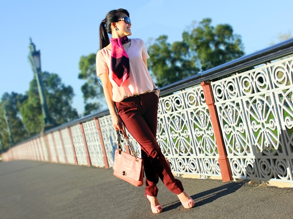
 A girl never strays too far from the pinky or rosy hues hey? =P
With a little determination, I managed to find all the components I needed to take "pink" to town! Even the chiffon material from the t-shirt harmonised with the silk scarf.
A girl never strays too far from the pinky or rosy hues hey? =P
With a little determination, I managed to find all the components I needed to take "pink" to town! Even the chiffon material from the t-shirt harmonised with the silk scarf.
If you are like me and avoided colour harmonisation for nearly all of your life, you are not alone and I hope you will take a chance and experiment it like I have. I am almost certain that this will not be the last posting you will see on harmonious colours!
Pants: Zara;
Sunglasses: Chanel (also seen here);
Shoes: Tony Bianco
Thank you so much for reading!
If you like what you read, please subscribe for future postings and "like" us above on Facebook.


9C400192EF
ReplyDeletekiralık hacker
hacker arıyorum
kiralık hacker
hacker arıyorum
belek
F25EF6BE
ReplyDeletesilivri esçort
beypazarı esçort
esçort bayan ağrı
akdeniz esçort
konak esçort
çerkezköy esçort
esçort bayan tekirdağ
kırşehir esçort
çubuk esçort